Presentation of data class 11 notes are presented in this post for easy access to the students. By taking these notes, you can stay active and engaged throughout your reading, revision, and lectures. They also help with clear thinking and understanding. Choose the most important ideas to focus on. These notes provide a useful record of important information and its sources. You’ll be able to recall better what you heard with these notes.
- Presentation of data
- Methods of presentation of data
Presentation of data class 11
The presentation of data in such a clear and appealing manner that it is simple to comprehend and analyse is referred to as “data presentation.”
Methods of presentation of data
- Textual or descriptive presentation
- Tabular presentation
- Diagrammatic presentation
- Graphic presentation
Textual Presentation under Presentation of data class 11
Data are presented in the form of text or textual or descriptive presentation. This works well when the amount of data isn’t too big.
For example; The number of boys in class 10th A was 320, out of which 200 were from the humanities section.
- The only limitation it has is that one needs to go through the entire text for comprehension.
Tabular Presentation
In a tabular presentation, data becomes a part of any study, description, or text or becomes a matter of study. When numerical data is presented in a systematic way in rows and columns it is called tabulation.
Objectives of Tabulation under Presentation of data class 11
- Tables aim to present the classified data in an orderly way. The idea behind this is to simplify the complex data.
- Tabulation is very important to save space by providing the data in a meaningful manner.
- Tabulation facilitates quick comparisons among total observations.
- Tabulation is a phase between a classification of data and its presentation. Therefore statistical analysis becomes easier when it comes to Tabulation.
- Numbers and data can be easily identified in providing references.
Parts of a table
- Title; The title of the table should be attractive and informative.
- Size; The size of the table should be manageable.
- Attractive presentation; A table should be appealing to the eye.
- Suitable purpose; A table should stick to its statistical information.
- Simple; It should be easy to comprehend.
- Comparison of data; The data that needs to be compared should be placed in columns and rows.
- Columns and rows; The columns and rows should be numbered for reference.
- Clarity; A table should be complete and self-explanatory.
- Units; The units of the variables should be specified, such as Price In ₹, weight in kg.
Classification of Data and Tabular Presentation
- Qualitative Classification of Data and Tabular Presentation; This occurs when data is classified on the basis of qualitative attributes.
- Quantitative Classification of Data; This occurs when data are classified based on the quantitative characteristics of a phenomenon.
- Temporal Classification: Data are categorised using a temporal classification system, with time serving as the classifying variable.
- Spatial Classification; Location takes on the role of the classifying variable in spatial classification. It could be a district, a town, a village, etc.
Types of Tables under Presentation of data class 11
- Classification by Objective or Purpose These tables are divided into two categories:
- Table for All Purposes: A General Purpose Table covers a wide range of information on the same topic and provides a detailed representation of the raw data. The data are presented without any particular analytical purpose. These tables typically have a large size and are typically included for reference in the appendix. There are numerous applications for these tables. They are used a lot in the government departments’ reports. Other names for it include “Reference Table” and “Repository Table.”
- Table for Special Purposes: These tables give data intended for a specific enquiry. Take, for instance, a company’s annual production figures. The results of data analysis are presented in these typically brief tables. Other names for it include “Text Table,” “Summary Table,” and “Analytical Table.”
2. Classification Based on the Nature of the Data Based on the nature of the data’s originality, there may be two types of tables:
- The initial table: The statistical data are presented in their original form in the Original Table, i. There is no rounding of the numbers in this kind of table. It contains information that was initially gathered from the primary source. Other names for it include “Primary Table” and “Classification Table.”
- Table Derivative: a table that displays averages, percentages, ratios, and other derived results from the original data, is referred to as a Derived Table. It conveys the data gleaned from the primary or original tables. A “Derivative Table” is another name for it.
3. Classification Based on Extent of Coverage Tables can be of two types depending on the extent of coverage (or construction):
- Plain Table: The simplest form of a table, this one presents data in accordance with a single characteristic. Since only one variable is being investigated, the univariate frequency distribution is presented in a one-way table. Other names for it include “One-way Table” and “First Order Table.”
- Complex Table: The term “complex table” refers to a table that organizes data according to two or more characteristics. There are three parts to a complex table based on their characteristics:
- The Double or Two-Way Table: It details two aspects of a particular phenomenon that are interconnected. The table, for instance, would transform into a two-way table if the numbers of Class XI students in various sections were further divided according to gender.
- Treble Table, or three-way table: Three data characteristics are categorized in a three-way table. It details three characteristics of a particular phenomenon that are connected to each other. A three-way table would be required in the case of the two-way table if the students were further divided into day-scholars and hostellers.
- Table of Manifolds: Manifold Table is the name of the table that describes more than three data characteristics. Numerous interrelated issues or characteristics of a given phenomenon are described in these tables. A table in this form is the most complicated.
Diagrammatic and Graphical Presentation under Presentation of data class 11
Diagrammatic presentation of data refers to the process of presenting data straightforwardly and appealingly.
- These transform the extremely abstract concepts contained in numbers into a form that is more tangible and simpler to comprehend.
Merits of Diagrammatic presentation
Diagrams give a bird’s eye-view of the whole mass of statistical data and are extremely usefu and significant. The following are some of the benefits or applications of diagrammatic presentation:
- Diagrams are eye-catching and powerful: Even a layperson can be drawn to data that is presented in the form of diagrams because of their usefulness and advantages. As a result, diagrams attract more attention than figures do. In everyday life, while reading newspapers, magazines, and other publications, We mostly look at the diagrams, but we skip over the figures. As a result, diagrams are frequently used in public events like board meetings, conferences, exhibitions, seminars, and others.
- Attractive and impressive, easy to remember, simplifies data, cuts down on time spent making comparisons, and provides additional information 2. Simple to Recall: Diagrams help people remember a lot. Compared to figures presented in tabular form, the mental image created by diagrams lasts significantly longer.
- Data is simplified by diagrams: Diagrams are used to simplify and make easy-to-understand representations of huge amounts of complex data.
- Diagrams are time-saving: The complicated mass of data is simplified by diagrams. Therefore, data that is presented in the form of diagrams is easy to comprehend. However, it takes a lot of time to analyze the significance and trend of large amounts of data.
- When making comparisons, diagrams are helpful: Using diagrams to display two sets of data makes it simpler to compare them. Through the use of diagrams, for instance, it is simple to compare the population growth rates of various nations.
- Universality of Application: This method can be used anywhere, at any time, and in any place. The majority of subjects and other fields employ this method.
- Diagrams provide additional data: Diagrams not only show the characteristics of the data, but they also reveal other omitted facts and relationships that cannot be determined by tabulating or categorizing the data.
Different kinds of diagrammatic presentations under Presentation of data class 11
- Pie Diagram
- Bar Diagram
- Frequency Diagram
- Arithmetic line graph
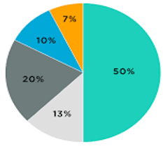
Pie Diagram
A pie diagram, also known as a circular diagram, is a circle with various segments that represent the percentage values of a series. These diagrams do not show the exact value of the variables.
Steps to construct a pie diagram
- Using a compass, draw a circle of the right size, taking into account the size of the paper and the data to be represented.
- Make percentages of the total from the values of the various components.
- In the circle, the percentage values are converted into the appropriate degrees. Since each item’s percentage value is equal to 100 and a circle contains 360 degrees, one percentage value is represented by 100 360 degrees, or 3.6 degrees. To determine the number of angles, multiply each percentage value by 3.6.
- To draw the angles that are represented by the first component, use a radius, preferably horizontally, as the base line. The new line will serve as the foundation for the angular representation of the second component. This procedure should be repeated until each component is represented.
- For proper identification, depict various components in various shades, designs, or colours .
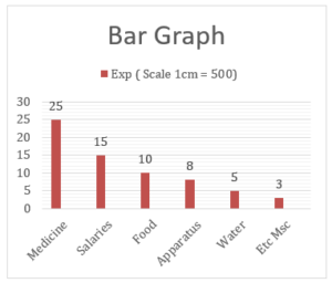
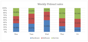
Bar Diagram under Presentation of data class 11
Bar diagrams are diagrams in which data are shown as bars or rectangles.
There are four types of Bar Diagrams;
- A simple bar diagram is constructed from a single set of numerical data. The various bars represent various items.
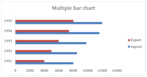
- A multiple-bar diagram is one that simultaneously depicts two or more sets of data. Most of the time, this kind of diagram is used to compare two series sets.
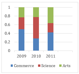
- A subdivided bar diagram shows both the total values and the parts of a data set at the same time.
- A percentage bar diagram is one that simultaneously depicts various portions of a data set’s values in terms of percentage.
Limitations of diagrammatic presentation
Nowadays, diagrams enjoy a lot of popularity. However, despite their utility, they are constrained in some ways. The following are the restrictions:
- Experts will not benefit: Diagrams only provide a hazy understanding of the issue, which may be useful for the average person but not for an expert who wants a precise understanding.
- Limited Details: The information provided by diagrams is limited and approximate. We must refer to the original statistical tables for comprehensive and precise data.
- They can only be used in comparison studies: Only when comparisons are desired are diagrams useful. A single diagram is not very important. It can only be interpreted in conjunction with another diagram that can be used as a comparison.
- Easy to Misuse: Diagrams are susceptible to easy misuse. If the wrong kind of diagram is used, it will draw false conclusions. As a result, one should always take precautions against them.
- Lack of Additional Research: Diagrams cannot be investigated further.
- Impossible Presentation with a Minute Difference: Diagrams fail to reveal minute variations in large figures (observations). Diagrams only show values with a very low level of precision. For instance, if two significant figures, such as 8,560 and 8,500, are depicted in a diagram, the difference will not be very obvious.
Graphic presentation under Presentation of data class 11
Advantages of Graphic presentation
The following are the main advantages of using graphics to present data:
- Impressive and appealing: Compared to tables of figures, graphs are always more attractive and impressive. Graphs can explain a fact that is hard for the average person to comprehend. As a result, the expression “a picture is worth a thousand words” applies.
- Data presented in a way that is easy to comprehend: Graphs assist in simplifying and comprehending complex data. Both the observer and the statistician benefit from the time and effort saved.
- Using as a comparison: Graphs make it simple to compare two or more phenomena.
- Where the positional averages are: Positional averages like the median, mode, and quartiles can be found using graphs.
- No need to be proficient in mathematics: Because they are so straightforward and straightforward, comprehending the graphs does not necessitate a great deal of technical knowledge. It’s easy for even a layperson with no mathematical background to understand.
- Contributing to Predictions: Trends that could occur in the near future can be better predicted using graphs.
- Benefit for all: Graphs can now be used in a variety of fields, including trade, economics, government agencies, advertising, and more.
Functions of Graph under Presentation of data class 11
- To make complex data simple.
- To make comparisons easy.
- To check on accuracy.
- To make more penetrating analysis.
Types of Graphs under Presentation of data class 11
Frequency Diagram
Frequency diagrams like the histogram, frequency polygon, frequency curve, and ogive are typically used to represent data that is composed of grouped frequency distributions.
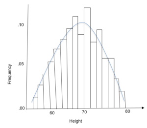
- Histogram; A histogram is a diagram with only two dimensions. It is a collection of rectangles with areas proportional to class frequency and passes serving as the intervals between class boundaries.
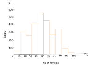
Two types of Histogram frequency distribution are;
- Histograms of equal class intervals
- Histograms of unequal class intervals.
- Polygons are another form of diagrammatic presentation of data. It is created by joining the middle points of each rectangle’s tops in a histogram. On the other hand, a polygon can be drawn without creating a histogram.
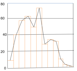
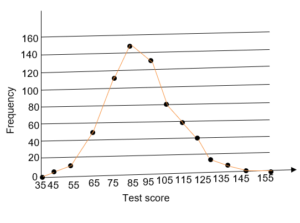
- Frequency Curve; A frequency curve is plotted by joining the midpoints of all histogram tops with smoothed freehand curves rather than straight lines.
- Ogive or Cumulative Curve; The ogive or cumulative curve is the smooth curve that is created when cumulative frequency data are plotted on the group paper.
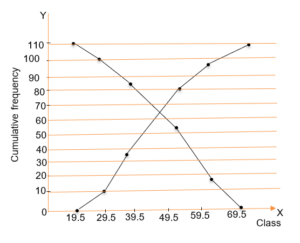
- There are two ways to make a cumulative frequency curve or ogive:
- The less than method, adds the frequencies corresponding to each upper limit of the series starting with the upper limit of the first values.
- More than Method: We take the cumulative total of the frequencies starting with the lower limit of the first class interval in this method.
Line Frequency Graph; They are used to depict discrete series.
Arithmetic Line Graph
An arithmetic Line graph is also known as Time series; This graph plots time (hour, day, date, week, month, and year) along the X-axis and the variable’s value along the Y-axis.
There are two types of arithmetic line graphs.
- One variable graph
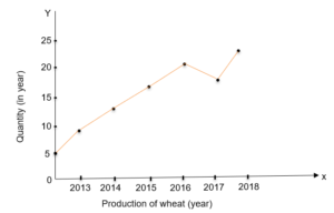
- Two or multiple variable graph
Limitations of graphic presentation under Presentation of data class 11
The following are the drawbacks of graphic presentation:
- Application Limitations: They are primarily intended to inform the general public about quantitative facts. Graphic presentation is of little use to experts.
- It’s possible to misuse them: A significant variation in the graph’s shape may result from a minor challenge or measurement error. As a result, it may result in false positives. Even biased individuals can use it to present a false narrative.
- Subjective: In nature, graphs are subjective. Each person’s interpretation is different.
- Lack of Precision: The precision of the data is not shown by graphs. They only display data fluctuations. As a result, they are not suitable for testing the data’s accuracy.
Conclusion
Presentation of data class 11 notes give a wholesome definition of presentation and various related concepts. You can stay active and engaged throughout your reading, revision, and lectures by taking these notes. Additionally, they aid in clear thinking and comprehension. Selectively identify important ideas. A useful record of important information and its sources can be found in these notes. These notes will help you remember what you heard better.